Question One - In what ways does your media product use, develop or challenge forms and conventions of real media products?
The song I chose for my music video is 'Things We Lost in the Fire' by an indie/pop band, Bastille. The band are very popular and have had their own headlining UK and US tours, as well as playing at festivals across the UK. 'Things We Lost in the Fire' already has an established music video that has been viewed in the UK over social networking sites such as YouTube, Vevo, Facebook, Twitter and more, building up a massive 14, 114, 485 views in just 8 months. I was inspired by music videos from Bastille themselves such as Bastille - Pompeii but also The 1975 - Sex and You me at Six - Lived a Lie plus many more as they all display clear narratives and reflect the indie/pop genre really well, which I wanted to be able to do. The song I chose is similar to the songs I just named, therefore I felt like I could take techniques from these videos and put them into my own enabling me to represent the indie/pop genre to the target audience and allow them to relate to the video. I planned to create a narrative video, with key elements of continuity and a clearly followed storyline including performance because when I was researching I found this was a key feature to advertise the artists as well as suiting the target audience needs through a story. I did not plan to do an abstract video. However this could of possibly fit my genre if done correctly, but I feel this may of been more typical of the indie or indie/rock genre and would not fit the codes and conventions needed for my video to be effective.
One of the codes and conventions of
music videos in the indie/pop genre is usually to promote the artist or band
through a performance aspect within the video so that the audience can relate
to the artist as well as attract and entice the audience. An example of a video
which has a performance aspect is You Me at Six – Lived a Lie, their intention
is clear, the full video is performance from the band and the lead singer,
theyre attempting to show who they are and their genre of music through the
video by promoting themselves due to it being a new sound for them as it is a
single off their debut album. This is something I thought was important to
portray in my own music video as the performance allows the audience to see
that the artist can perform confidently and are happy to promote the genre of
music they like to write inspiring teenagers of today.
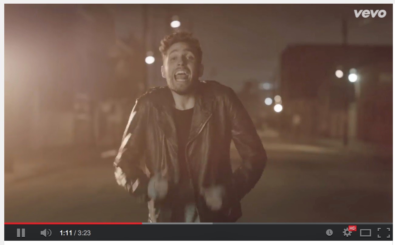

 In the video Lived a Lie by You Me at Six they use just the performance convention of the genre and no narrative or abstract aspect of the video. I went against the conventions of this music video and used the performance aspect of my artist but then also incorporated a narrative into my video so that it was more appealing to a larger audience. I also did not want to include a live band performance as I felt if this is done wrong it is unprofessional and I wanted my video to look realistic and eye catching rather than unrealistic.
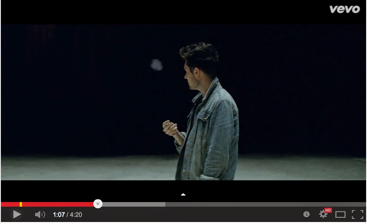
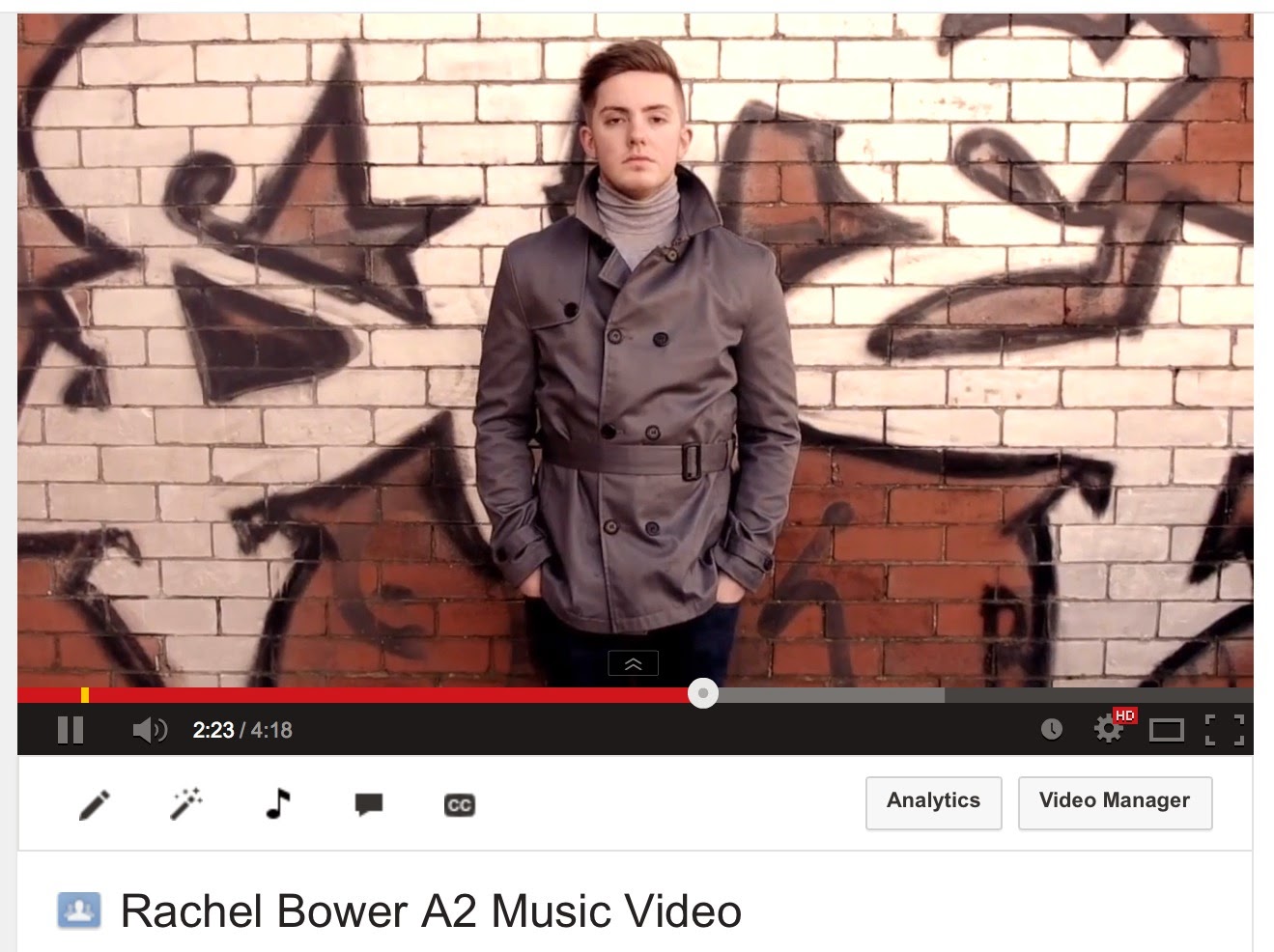

I also thought it was important for the costume of my characters to be able to reflect the style of my genre and represent the style of my target audience, so I made sure outfits fit the genre correctly and represented the typical Indie/Pop dress code. I did this by researching into existing products and seeing what they was wearing. This mainly consisted of dark coloured, simple and laid back clothing to create a relaxed yet edgy feel to the video.
Another convention my media product used is following a conventional use of a narrative. Using a narrative in my video allowed the audience to follow the storyline and relate to the story whilst relating to the lyrics of the song. The narrative creates imagery for the audience allowing them the opportunity to use their own imagination leaving the video memorable for the audience. The use of special effects in a narrative of an Indie/Pop video is becoming more and more common and that is why I involved many effects to make the video more enticing and eye-catching, pulling in the audience more than the actual song. I followed the conventions of videos such as The 1975 - Sex, which you can view below.
My narrative consists of a boy (the artist of the song) and a girl who were once in a relationship but have now split up. The boy actor is reminiscing on their relationship and the video goes into a dream-like feel to reflect the memories he is looking back on through pictures and moving image which they filmed when together. The girl and boy meet in the memory but then she disappears from him and out of the picture, which the ending represents. Almost relating to the lyrics of a fire burning out of the relationship.
The mise en scene part of my video was not easy as I wanted places that were going to represent my genre well as they are very important to what the music video was going to look like. I chose
Hessle Foreshore and an abandoned industrial estate as my prime locations for my video with snippets of my back garden and near my car, down a street. This enabled me to have a lot of space to create a variety of different action shots as well as having different elements of locations to help the audience follow along with my narrative. The distance of the locations from my house were about a twenty five minute drive, which was okay for me as I am able to drive myself this allowed me to shoot easily when needed and able to re-shoot urgently incase of illness or bad weather. It was difficult to get my actors present at the same time but I finally got a day and a week night were I worked with them both for the scenes they had to do together. However the rest of the filming was done separately and at different locations on different days, which I made sure was planned well in advance so they knew about it for work purposes or other commitments. This was not consuming or to much effort for me as I was able to drive to my locations as well as pick up and take my actors home.
Overall, I filmed on 5 different dates from
January 2014 to
March 2014 accumulating around 8 hours of footage approximately.
I learnt that CINEMATOGRAPHY is usually very similar across the genres of music videos with slight differences depending on the type of genre of music and the form of the video. The three main types of camera shots that are used in every video are close ups, medium close ups and long shots. Close ups and medium close ups are used to see emotion and facial expressions of the artist, the lyrics that they are singing as well as the outfit and make-up of the artist. I used a lot of shots, which were all different types as the lyrics are very relatable to many teenagers and young adults therefore I was able to emotionally engage my audience through these types of shots.
LONG SHOTS act as establishing shots which bring context and understanding to the video and also allow you to see performance and develop the narrative. I used long shots to show the narrative by establishing locations before moving on to the next shot which further developed the girl and boys relationship.
OVER THE SHOULDER SHOTS are used less regular but they can show the perspective of the artist as a point of view shot, which I used to help with the narrative of the girl and boys relationship connoting her walking away from the relationship. This is not usually conventional of a video however, I did see this in a bastille video and felt I could follow in their footsteps.
My Video ^^^ Bastille Video ^^^
CAMERA MOVEMENT is another important way of making the music video flow from one shot to another. Pans can act as another way of giving us a point of view shot or including the location and emotion in the show, which a still image may not be able to do. They allow for other people to be in the shot but are also more interesting than a still shot. I used a very quick PAN SHOT via a long shot. The pan started of the location with the girl in the very far right hand corner of the camera before moving left to right to show that she had found something, it also made the effect of the audience having tot look at her quickly in suspicion of what she is doing. I also used slow pans when the boy and girl finally come together, they notice with other and I do a large pan from right to left behind the boy to see his point of view of the girl and also right to left behind the girl to see her point of view of the boy and show their emotion staring into each others eyes.
ZOOMS are effective in making shots flow but they also act as a way of seeing more emotion as you are closing up to the performers face or a specific object. Then when zooming out you are usually showing the artist or a location. I used a zoom when it came to using the effect on the boy and girls eyes. I wanted to use the zoom in and add the effect on top and then use the effect to hide the fact the eyes had switched and when zooming out it was no longer the boy but the girl.
CRANE SHOTS are a good idea when it comes to music videos as they are able to show a lot of performance e.g dancers and the artists in a location or a specific part of your narrative. However the more I looked into existing products, the less indie/pop videos used these and are more conventional of the pop or dance genre. I did not chose to use crane shots as I felt it was unconventional of my genre.
CONTINUITY EDITING and MONTAGE EDITING are two main types of editing and they are generally both used in most videos. Montage editing allows lot of different things to be going on in the video and giving an emotive or upbeat performance. Where as continuity editing is better for dance routines and giving an emotional live performance. I found that continuity editing is found in videos that feature performance of the band or artist such as You Me at Six - Lived a Lie. Quite a lot of videos I watched in the indie/pop genre do involve some sort of narrative and are not conventionally using continuity editing unless its a performance of the band or artist. Indie/pop videos rely heavily on montage editing which follows a narrative this is why I chose to include a narrative rather than take an abstract approach. Videos that include montage and continuity such as The 1975 - Sex are the best ones as you get to see the artist performing and showing their fans what they love to do but also including a narrative, letting the audience relate to and reflect. I chose to go with using continuity and montage editing so that my audience could see the artist but also follow a narrative that almost related to the lyrics.
Editing JUMP CUTS into a music video is a good way of moving on from one scene to another or making something seem more dramatic. I have used jump cuts throughout so that the narrative can continue and people can follow when jumping to and from performance and narrative. I think this worked well and follows the conventions.
The sound in a music video is usually simple as it contains the lyrics of a song but some music videos have a narrative voice over at the beginning, the end or both in which the voiceover informs the audience more in depth about the song or narrative. Sound effects can also be featured in a music, which I found are specific to the indie/pop genre as I found they were used in videos such as The 1975 - Sex. At the beginning and the end of this video you are able to her police car sirens. Volume may be manipulated so that the song goes quite and you can hear dialogue this is more commonly used in pop videos to help with a narrative.
The main singer from Bastille often features in his own music videos, some examples are
Bastille - Flaws,
Bastille - Bad Blood,
Bastille - Pompeii. All of which are huge hits from their debut album. However some artists in the indie/pop genre are not known for appearing in their music videos and do not include lip-syncing. I have followed the conventions of most music videos and included my artist in the video allowing him to lip-sync and be involved in the narrative.
Before making my promotional poster for a magazine I searched google for existing products allowing me to look into the codes and conventions that are used on magazine adverts and posters.
I discovered that there is not much text involved on the adverts. All that is needed is a release date, where to buy the album from, a piece of information about the album, whether it be a song title or the fact its a new album. There is often a link to the official website of the artists and where you can buy or download the CD from.
This is my advert below:
I also researched into existing CD and Album cover products to get an overall idea of what these contained. I found that depending on the genre such as the indie genre the covers went from abstract to either very simple designs. Where as in the pop genre they often feature the artist or band on the front for further promotion and grab your attention when on the shelves in the shops such as HMV. I found that CD'S needed to include the label they are signed to, a copyright law, the sales group logo and then the fact it is either a CD or DVD. The back cover needs to include all songs that are featured as well as your labels logo again with a barcode.
My finished product is below:
The only improvement I would make on my DIGIPAK is the fact I did not include a barcode on my product therefor making it unrealistic and unprofessional.
Below are two Prezis I created when researching into my genre conventions and form conventions in the research and planning stages.
Codes and Conventions of my Chosen Genre
Formal Codes and Conventions of Music Videos
Overall I think I followed the codes and conventions of my chosen genre very well when it came to creating my media products as well as challenging the codes and conventions.

 In the video Lived a Lie by You Me at Six they use just the performance convention of the genre and no narrative or abstract aspect of the video. I went against the conventions of this music video and used the performance aspect of my artist but then also incorporated a narrative into my video so that it was more appealing to a larger audience. I also did not want to include a live band performance as I felt if this is done wrong it is unprofessional and I wanted my video to look realistic and eye catching rather than unrealistic.


 The laid-back and grungy look was something I tried to represent in the cover of my digipak as this is the first thing the audience sees when buying the album. Using a simplistic black cover with the bright white text in the middle allowed my album to stand out against all the bright colours but also makes my audience want to buy the CD and take a look inside. I feel leaving the images to the inside of the digipak kind of helps with the promotion of my CD as it is almost like the consumers will be getting exclusive images if you buy the CD. However on the DVD CD I used the image of jack and mell holding hands to reflect my music video and my promotional poster.
 I edited my promotional poster advert on pic monkey and inserted it onto a magazine and a bus stop billboard using Pic Monkey as this is how it would be viewed in real life. This showed me how effective it would look to my audience. Overall, I feel my advert looks effective placed in an open magazine as the image dominated the page and stands out through the use of bright colours and the effective visual imagery of the boy being full of colour and a ghostly girl on the left hand side making you question why she is fading out the image. The font is large and clear so the reader can be aware of the adverts intention and who the artist is immediately. I also used a bus stop image as this will open up for a larger market rather than an intended market in a magazine. The bus stop looks very effective and real to some extent. I think that this would look good in real life as it is very clear on what the poster is intending to do and visually attracts the eye. However advertising on things like this would be costly to an artists. My artist intends to be less mainstream than the pop genre so therefore maybe I wouldn't advertise on a bus stop billboard but more like to see it in a certain type of music magazine.

