Friday, 11 April 2014

Question Four - How did you use media technologies in the construction and research and planning and evaluation?


I also used Slide Share, Prezi and GoAnimate in all stages of my work, these websites allow for you to distribute information and images in a more interesting way. Below are some example of what I have used them for over the planning and research months.

History of Form Prezi


Audience Theorist Go Animate

Stewart Hall - Reception Theory - 1980


Music Video Storyboard on Slide Share


The good thing about Prezi, Go Animate and Slideshare is that the projects you create are quickly and easily able to be embedded onto blogger.

Wednesday, 9 April 2014

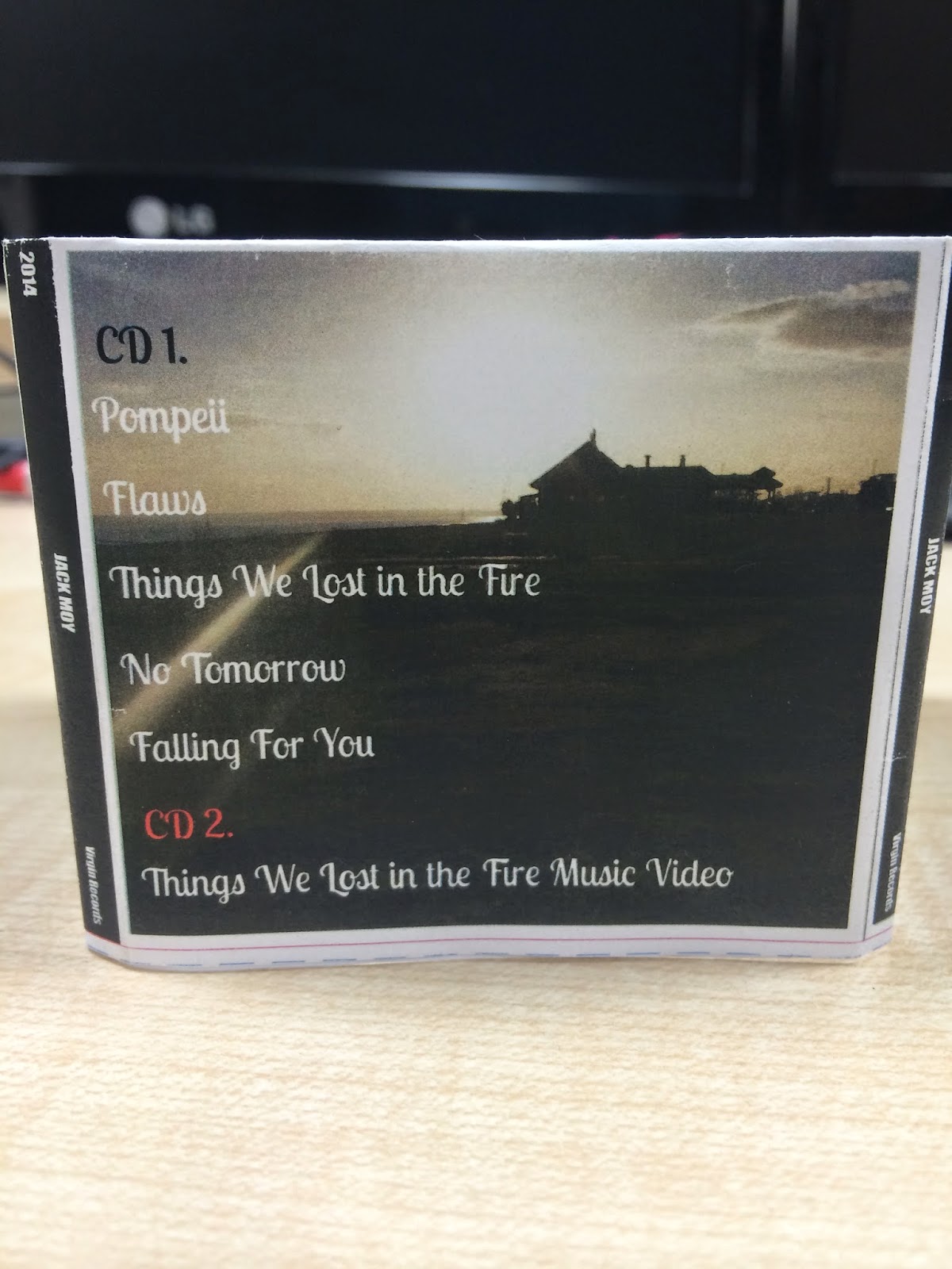
DigiPak in Real Life Form


DIGIPAK FINAL DRAFT


My final digipak was created by photoshop and picmonkey.I have used continuity through colours and images to mirror my music video for the digipak. 

Tuesday, 8 April 2014

Promotional Poster in the Real World!


Above you will be able to see that I have edited my promotional poster into a magazine and onto a bus stop to see if they look realistic and professional. I like the colour scheme I have used as it is eye catching and fits really well with following the conventions of my genre and the idea the genre like to portray across to their target audience.
Fifth Draft of Promotional Poster


After feedback from my last draft I went and created my next draft adding logos of where you can buy the CD from swell as download it. I changes the colour scheme to keep with the continuity of the CD and poster as well as adding a paint effect to the poster of a dark blue shade to help make the title stand out more and the poster be overall more appealing to my audience.

Monday, 7 April 2014


Feedback from Draft 2 of Ancillary Texts


I got three peers within my target audience to feedback to me on my above products.


Harrison Dunn (18)
  • I like the use of images, I like how you have edited in different images to blend together.
  • The use of the simplistic front cover will stand out against other CD covers when it is being sold in shops.
  • The back cover does not have a barcode on it so it does not seem a realistic product.
  • Would like to see a logo of which label the artist is signed to.
  • The promotional poster text at the top could be more centred than to the left.
  • Could add images to promotional poster of where you can buy the album.
Autumn Calver  (18)

  • I love how you have blended the girl into the images I think it represents the music video really well.
  • I like the fact you have used a simple front cover and if you was to buy the album you would get pictures of the artist inside its kind of like getting exclusive pictures instead of him being on the front cover.
  • Im not sure on the blue you have used on the back cover as it just seems to stand out to much against all the dark yet intriguing colours of the rest of the album. Although it is continuous on your promotional poster I would look into using a darker colour maybe.
Courtney Talbot (18)
  • I like the use of the photography aspect and how you have edited the images so that they blend together.
  • Maybe you could add a faded picture of the artist behind the writing on the front cover just so the album is more recognisable.
  • I would maybe darken the image for the back cover so it fits the front cover more.
  • Apart from that I love the ideas you have brought across for the album as they relate really well to your music video.
Second Draft of images for 6 Panel DigiPak!


During filming I took many new images to use for my ancillary texts because after my first draft I felt they was not up to standard of the indie pop/rock genre and that the images were not well shot. I used the website 'PicMonkey' to edit all of my images above due to restrictions of not having photoshop on my laptop at home. Using 'PicMonkey' allowed me to be doing work outside of the classroom time and on a weekend.