Feedback from Draft 2 of Ancillary Texts


I got three peers within my target audience to feedback to me on my above products.
Harrison Dunn (18)
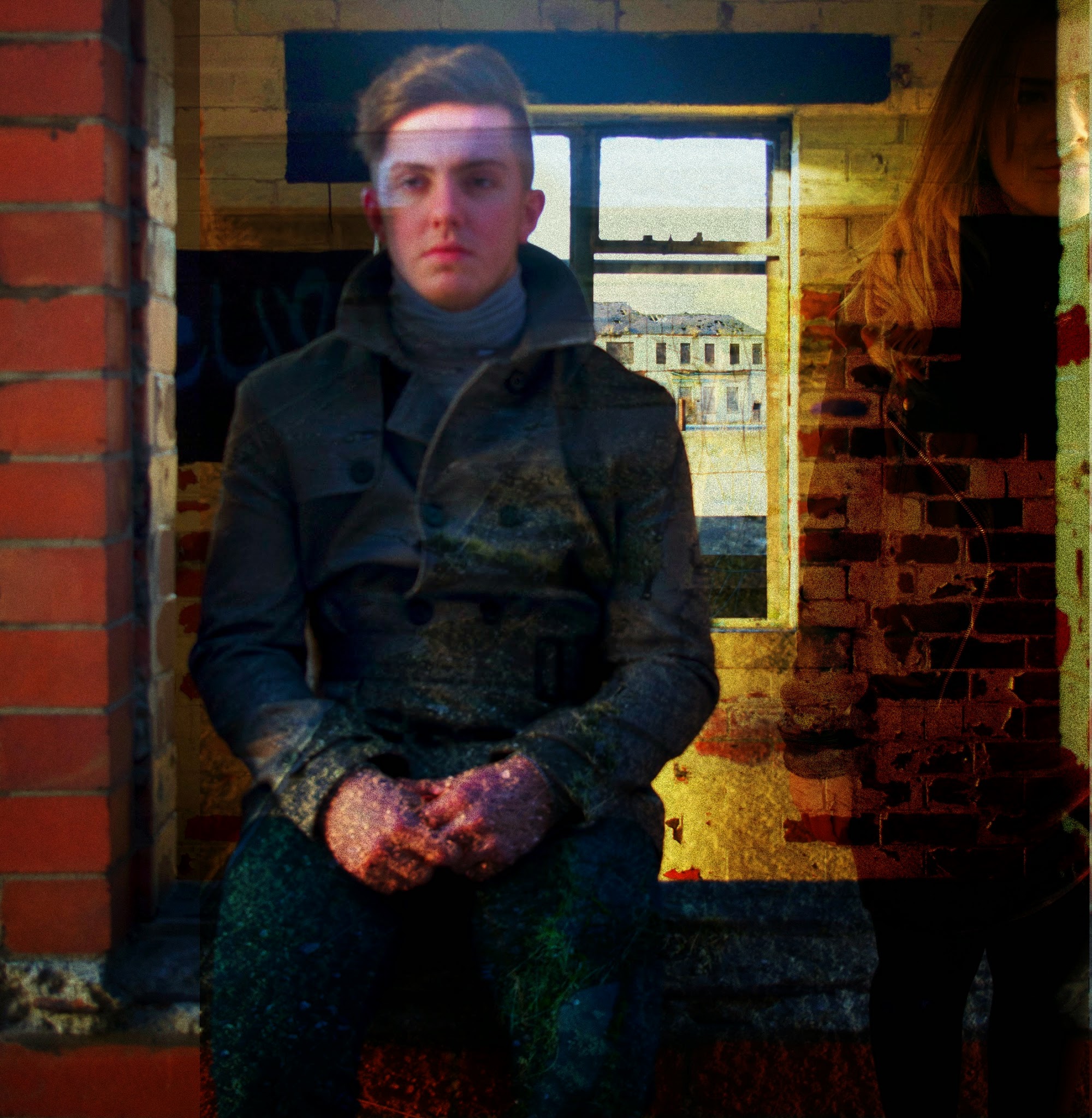
- I like the use of images, I like how you have edited in different images to blend together.
- The use of the simplistic front cover will stand out against other CD covers when it is being sold in shops.
- The back cover does not have a barcode on it so it does not seem a realistic product.
- Would like to see a logo of which label the artist is signed to.
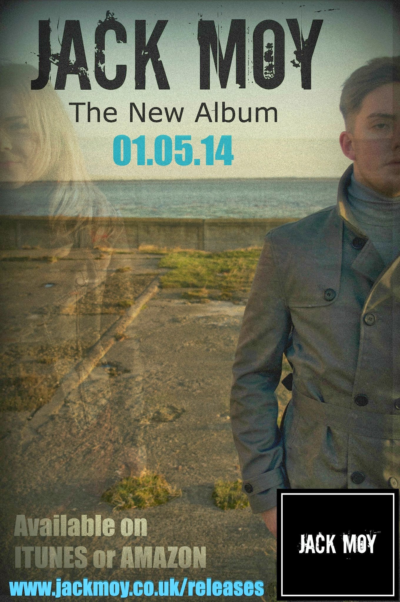
- The promotional poster text at the top could be more centred than to the left.
- Could add images to promotional poster of where you can buy the album.
Autumn Calver (18)
- I love how you have blended the girl into the images I think it represents the music video really well.
- I like the fact you have used a simple front cover and if you was to buy the album you would get pictures of the artist inside its kind of like getting exclusive pictures instead of him being on the front cover.
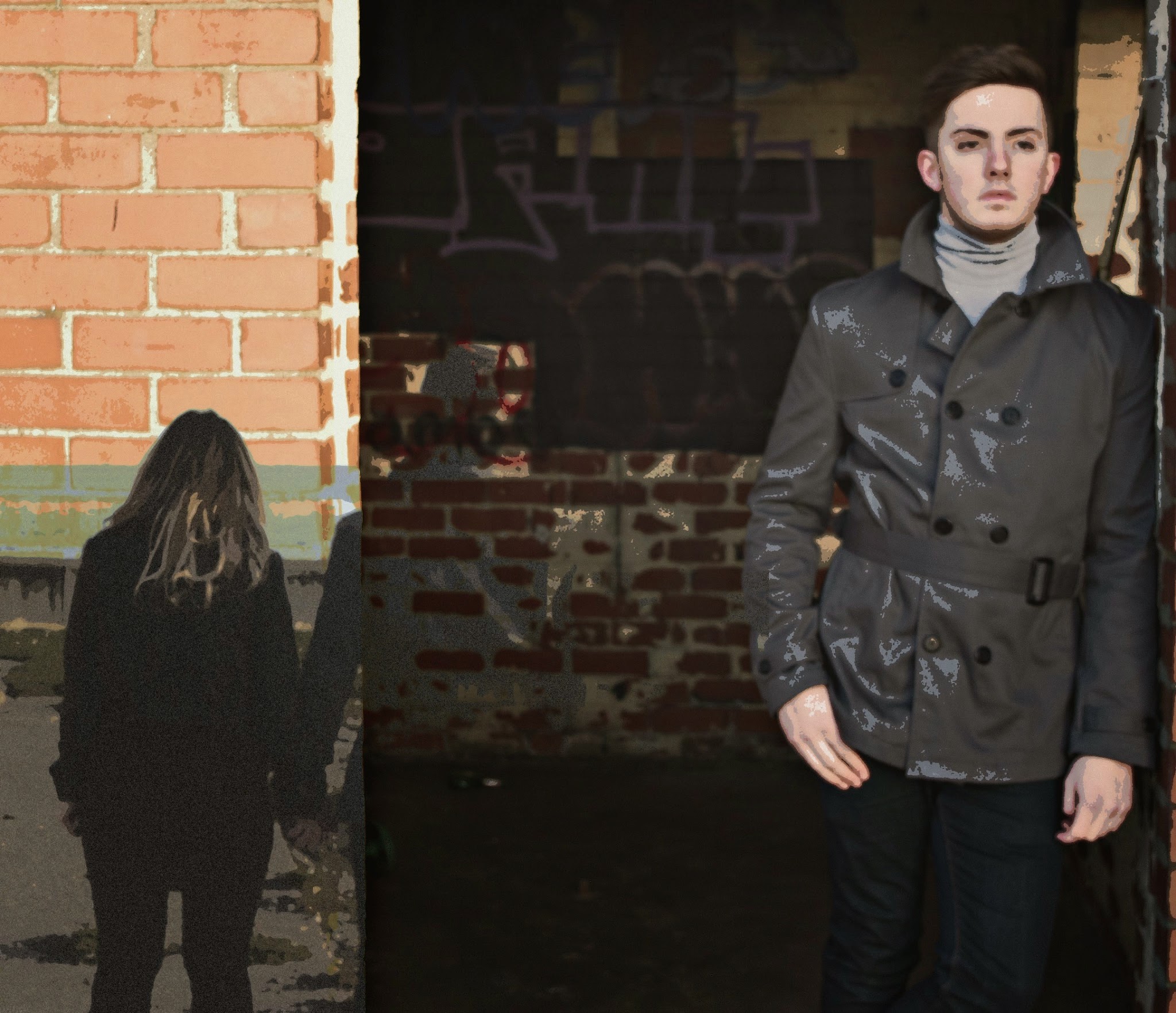
- Im not sure on the blue you have used on the back cover as it just seems to stand out to much against all the dark yet intriguing colours of the rest of the album. Although it is continuous on your promotional poster I would look into using a darker colour maybe.
Courtney Talbot (18)
- I like the use of the photography aspect and how you have edited the images so that they blend together.
- Maybe you could add a faded picture of the artist behind the writing on the front cover just so the album is more recognisable.
- I would maybe darken the image for the back cover so it fits the front cover more.
- Apart from that I love the ideas you have brought across for the album as they relate really well to your music video.
No comments:
Post a Comment